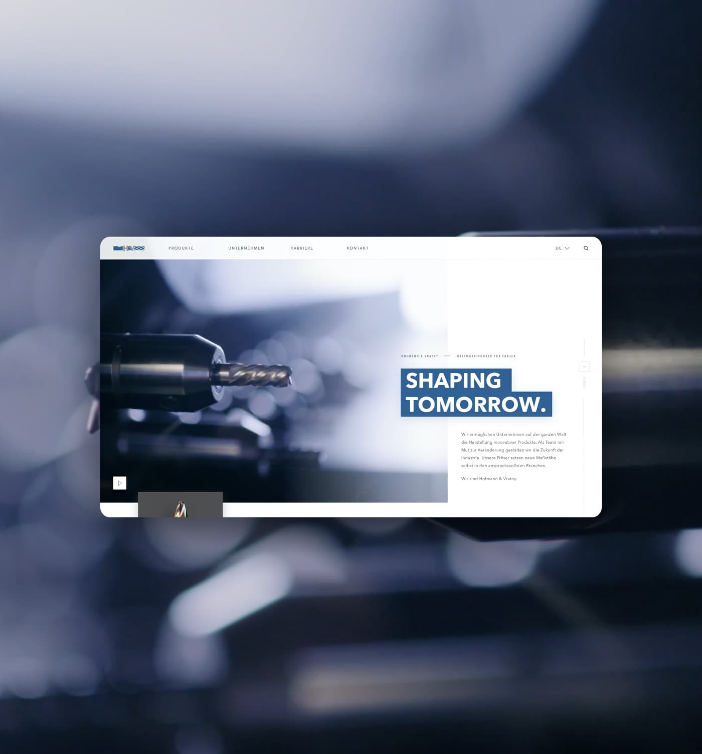
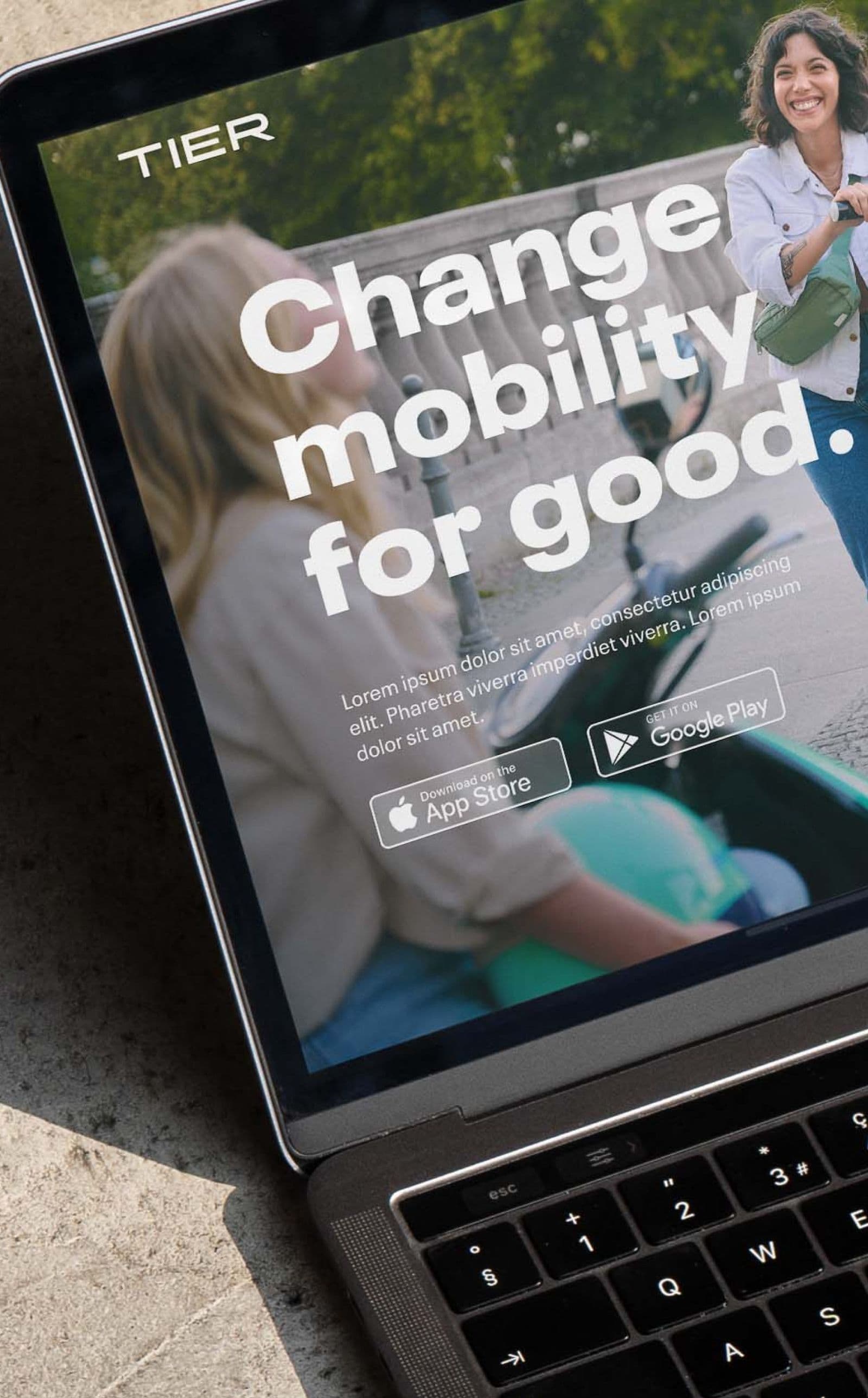
We developed a fast and well-proven system for your new website indistinguishable from extensive platforms and capable extending to one.

Discovery Insights
To immerse ourselves in your business and your brand, we review everything that is already there and familiarize ourselves with you. This way, we are already well prepared for our workshop.
Platform Concept
Let's get moving. Core Concepts based on your goals and the desired business impact on SEO, Navigation, Customer Experience and Visual Direction.
Platform Design
We have defined a direction and develop the Design System including the relevant Web Modules, elements that will serve as the foundation of the new platform.
Platform Development
Development Sprint bringing the design and concepts developed before to life. Including animations and optional additional features, extensions or functionality (*duration might differ)
Testing
We test extensively guaranteeing cross-browser and cross-device compatibility. You can already start including all content to the page and make it ready to launch.
Tracking & GoLive
We release your benchmark digital experience. And start discussing the future development (if required)
Our partners trust in us

Don't be a stranger. Let's discuss your digital future.